Table of Contents
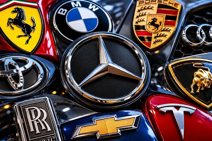
Car logos are more than just badges on the front of a vehicle. They tell stories about history, culture, ambition, and identity. Some logos have stayed almost unchanged for decades, while others evolved with modern design trends. When you see a famous car emblem on the road, you instantly connect it with quality, speed, luxury, or reliability.
In this article, you will discover the 10 most iconic car logos ever created and the fascinating stories behind them. From hidden meanings to surprising origins, these symbols became some of the most recognizable designs in the world.
Quick Summary Table 🏁
| Rank | Car Brand | Logo Design | Main Meaning | Why It Became Iconic |
|---|---|---|---|---|
| 1 | Mercedes-Benz | Three-pointed star | Dominance on land, sea, and air | Luxury and prestige |
| 2 | Ferrari | Prancing horse | Power and racing spirit | Legendary motorsports history |
| 3 | BMW | Blue and white circle | Bavarian roots | Performance and heritage |
| 4 | Toyota | Overlapping ovals | Unity and innovation | Global reliability |
| 5 | Porsche | Crest with horse | Stuttgart heritage | Sports car excellence |
| 6 | Audi | Four rings | Four companies united | German engineering |
| 7 | Lamborghini | Bull emblem | Strength and aggression | Supercar identity |
| 8 | Rolls-Royce | Double R symbol | Elegance and class | Timeless luxury |
| 9 | Chevrolet | Bowtie logo | Simplicity and recognition | American automotive culture |
| 10 | Tesla | Stylized T | Electric motor design | Modern EV revolution |
How We Ranked These Logos 🔍
We ranked these car logos using several important factors:
- Global recognition and popularity
- Historical importance in the auto industry
- Unique design and symbolism
- Emotional connection with drivers
- Influence on automotive culture
- Longevity and consistency over time
- Brand identity and storytelling
- Visual appeal and memorability
1. Mercedes-Benz – The Three-Pointed Star ✨
The Mercedes-Benz logo is one of the most respected symbols in the automotive world. The famous three-pointed star represents the company’s ambition to dominate transportation on land, sea, and air. This idea came from one of the company’s founders, Gottlieb Daimler.
The logo first appeared in the early 1900s and quickly became associated with engineering excellence and luxury. Even today, when you see the star on a car grille, you immediately think about status, comfort, and high-quality craftsmanship.
One reason this logo became so iconic is its simplicity. The clean silver star looks modern even after more than a century. Unlike many brands that constantly redesign their image, Mercedes-Benz stayed close to its original look.
The logo also carries emotional value. For many people, owning a Mercedes-Benz represents success and achievement. That strong emotional connection helped turn the emblem into a global symbol of prestige.
2. Ferrari – The Prancing Horse 🐎
Ferrari’s prancing horse logo has one of the most emotional stories in automotive history. The black horse originally appeared on the fighter plane of Italian World War I pilot Francesco Baracca. After his death, Baracca’s family suggested that Enzo Ferrari use the horse symbol on his racing cars for good luck.
Ferrari added a yellow background because yellow is the official color of Modena, Italy, where the company was founded.
The logo perfectly matches Ferrari’s personality. The horse symbolizes speed, strength, and elegance. Combined with Ferrari’s racing success, the emblem became legendary among car enthusiasts worldwide.
Another reason this logo stands out is exclusivity. Ferrari produces fewer vehicles compared to mainstream brands, making the badge feel special and rare. Seeing the prancing horse on the road still creates excitement for many people.
Over the years, Ferrari protected the logo carefully, helping maintain its luxury image and racing heritage.
3. BMW – The Blue and White Circle 🔵
Many people believe the BMW logo represents a spinning airplane propeller, but the truth is more interesting. The blue and white colors actually come from the Bavarian flag, honoring the company’s German roots.
BMW started as an aircraft engine manufacturer before moving into automobiles. Because of its aviation history, the spinning propeller story became popular over time, even though it was not the original inspiration.
The circular design gives the logo a balanced and premium appearance. It feels both sporty and elegant, which matches BMW’s identity as “The Ultimate Driving Machine.”
BMW’s emblem became iconic because it connects performance with everyday usability. Drivers associate the logo with precision engineering, strong handling, and luxury.
Even modern electric BMW models still carry the classic round badge, proving how timeless the design truly is.
4. Toyota – The Overlapping Ovals 🌐
Toyota’s logo may look simple at first glance, but it contains several hidden meanings. The three overlapping ovals represent the relationship between customers and the company, while the outer oval symbolizes global expansion.
The logo was introduced in 1989 to celebrate Toyota’s 50th anniversary. Before that, Toyota mainly used text-based branding.
One reason the logo became so recognizable is Toyota’s worldwide success. Millions of drivers trust the brand for reliability, fuel efficiency, and long-lasting vehicles. As Toyota expanded globally, the emblem became a symbol of dependable transportation.
The smooth curves of the logo also give it a modern and friendly appearance. Unlike aggressive sports car logos, Toyota’s emblem feels welcoming and practical.
Today, it is one of the easiest logos to identify anywhere in the world.
5. Porsche – The Stuttgart Crest 🛡️
Porsche uses one of the most detailed and sophisticated logos in the car industry. The crest combines symbols from Stuttgart, Germany, including a black horse and regional antlers.
The horse represents Stuttgart because the city was originally built on a horse-breeding farm. The red and black stripes come from the former Kingdom of Württemberg.
This logo became iconic because it instantly communicates performance and heritage. Porsche sports cars are known for precision, speed, and luxury, and the crest reflects all three qualities.
Unlike minimalist logos, Porsche embraced a rich and traditional design. That decision helped the company stand out in the sports car world.
For many enthusiasts, the Porsche crest feels like a badge of passion rather than just a company logo.
6. Audi – The Four Rings 🔗
Audi’s famous four-ring logo represents the merger of four German automakers in 1932. Those companies were Audi, DKW, Horch, and Wanderer. Together, they formed Auto Union.
Each ring symbolizes one of the founding companies. The design is simple but powerful because it tells a story of unity and cooperation.
Audi became globally recognized for advanced technology, luxury interiors, and sleek design. As the brand grew, the four rings became connected with innovation and modern engineering.
The clean silver rings also give the logo a futuristic feel. Even older Audi vehicles still look modern, partly because of this timeless emblem.
The logo proves that simple designs can often become the most memorable.
7. Lamborghini – The Charging Bull 🐂
Lamborghini’s bull logo perfectly matches the personality of its cars. Founder Ferruccio Lamborghini loved bullfighting and was born under the Taurus zodiac sign, so the bull became the company’s symbol.
The aggressive golden bull represents strength, speed, and power. That image fits Lamborghini supercars perfectly because they are loud, dramatic, and impossible to ignore.
The black and gold color scheme also adds a feeling of luxury and exclusivity. Unlike softer or more elegant logos, Lamborghini’s emblem looks bold and intimidating.
Over the years, the logo became a symbol of extreme performance and exotic design. Even people who know little about cars can usually recognize the charging bull instantly.
It remains one of the most exciting logos in automotive history.
8. Rolls-Royce – The Double R 🏆
The Rolls-Royce logo is all about elegance and sophistication. The famous double R stands for the company’s founders, Charles Rolls and Henry Royce.
The logo itself is simple, but the real magic comes from what it represents. Rolls-Royce vehicles are known for handcrafted luxury, silence, and attention to detail.
Another iconic part of the brand is the Spirit of Ecstasy hood ornament. This graceful figure became one of the most famous symbols in the automotive world.
The double R emblem communicates wealth and refinement without needing flashy design elements. That understated confidence helped Rolls-Royce maintain its reputation for over a century.
Few logos in any industry carry the same level of prestige.
9. Chevrolet – The Bowtie Logo 🎖️
Chevrolet’s bowtie logo is one of the most recognizable American automotive symbols. Surprisingly, nobody fully agrees on where it came from.
Some believe founder William Durant saw the design in a French hotel wallpaper. Others think it was inspired by newspaper advertisements. No matter the true story, the shape became deeply connected with American car culture.
The bowtie logo succeeded because of its simplicity and versatility. It looks equally good on trucks, sports cars, and family sedans.
Chevrolet’s long history in racing, muscle cars, and pickup trucks also helped make the emblem famous. Vehicles like the Corvette and Camaro gave the logo a performance reputation, while trucks built trust among working families.
Today, the gold bowtie remains an important symbol of American automotive history.
10. Tesla – The Modern Electric Symbol ⚡
Tesla has one of the newest logos on this list, but it has already become globally recognizable. The stylized “T” is not just a letter. According to Elon Musk, it actually represents a cross-section of an electric motor.
That hidden engineering meaning perfectly matches Tesla’s image as a technology-driven company.
The logo became iconic quickly because Tesla changed the auto industry. The company helped make electric vehicles mainstream and turned EVs into something exciting rather than boring.
Tesla’s minimalist logo also reflects modern design trends. It feels clean, futuristic, and high-tech.
Unlike traditional automakers that built their reputation over decades, Tesla created a globally recognized symbol in a relatively short time. That achievement alone makes the logo historically important.
Conclusion 🛞
The best car logos do much more than identify a brand. They tell stories about ambition, culture, racing history, engineering, and innovation. Some logos represent luxury and prestige, while others symbolize speed, reliability, or technological progress.
What makes these emblems truly iconic is their emotional connection with people. A great car logo can instantly bring memories, excitement, and admiration the moment you see it on the road.
Whether you love classic luxury cars, powerful supercars, or modern electric vehicles, these logos prove that great design can last for generations.
Frequently Asked Questions ❓
Why are car logos so important for automakers?
Car logos help create brand identity and recognition. They allow customers to instantly identify a company and connect the logo with certain qualities like luxury, reliability, or performance.
Which car logo is considered the most valuable in the world?
Many experts consider the Mercedes-Benz and Ferrari logos among the most valuable because of their strong luxury image and worldwide recognition.
Why do luxury car brands often use animal symbols?
Animals symbolize power, speed, elegance, or strength. Ferrari uses a horse, Lamborghini uses a bull, and Porsche also features a horse in its crest.
Have car logos changed a lot over time?
Yes, many brands updated their logos to look cleaner and more modern. However, most companies keep the core design elements to preserve brand recognition.
Which car logo is the oldest still in use today?
Peugeot’s lion logo dates back to the 1800s, making it one of the oldest automotive brand symbols still used today.


